Filed under: Uncategorized
For this project called Laundry, I began looking at old fashioned washing powders for shapes and colours however I developed my ideas and decided to focus on the care labels in your clothes for inspiration. I’ve found that most care labels are sightly different, whether its designed differently of holds different information. I took pictures of some of my own clothes and care labels and experimented with the symbols in photoshop…
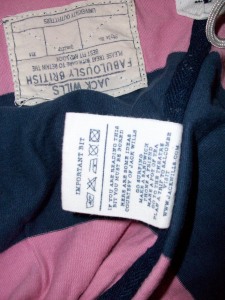
do people actually read these things?
Even the label reads, ‘If you are reading this you must be bored.’ It goes on to say, ‘Here are some ideas courtesy of Jack Wills. Go Surfing. Make a sandwich. Phone a friend. Make a pot of tea. Go to the theater. Plan a trip to Salcombe. Visit http://www.jackwills.com’ which I think is quite a clever design point. It does support the idea that not many people do read the care label even though it is important to ‘care’ for the garment in the right way by washing it correctly.
I took this image to make a design in photoshop.
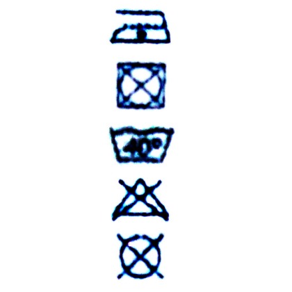
Care Label
Which I then made into this pattern after afew Photoshop lessons!
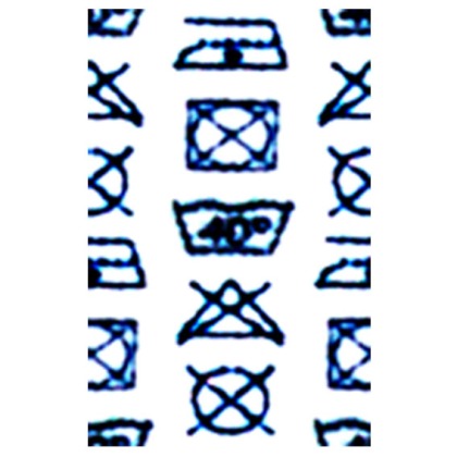
The final Pattern Design
I looked at the designer Henrik Vibskov as he uses print a lot in his work. I began to use knit at the start of this project and experiment with shrink techniques from washing however i felt my project would be best digitally based. This is afew images from Vibskovs collection, I like the way he presents his models, for example these have big egg-like shapes on there heads in quite comical positions. Nearly all his work is done in quite a different way, and he uses a lot of print which has been quite inspiring for this project.
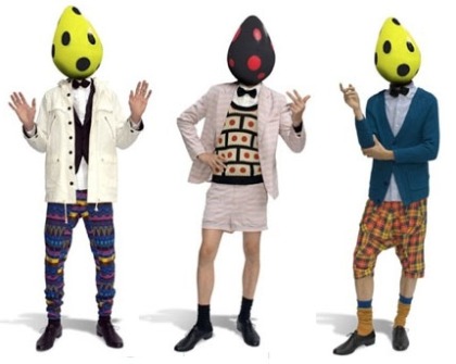
Menswear by Vibskov
Having looked at a number of different care labels I decided to stick with the one I choose in the begining and decided to put them onto a garment for my development. Here are afew of my designs:

A few designs from my collection.
Menswear tee shirts, aimed at late teens to early to mid twenties, probably a spring/summer collection for a high street shop such as Topman or H&M mens. I designed a illustration to be digitally edited to show my clothes being worn. I looked at a few fashion illustration books for ideas and decided to go for quite a cartoon feel but again with a digital edge. Here is the final illustration:
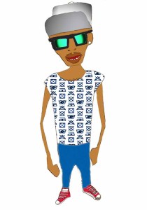
Final Man Illustration!
Having worked a lot with Photoshop with this project I’ve realised that things take time! This illustration alone took over an hour to get right. I feel as though i’m learning a lot but also realise that theres so much more I havn’t even touched yet. I’m abit unsure on most of the filters and just experimenting at the moment. I feel confident with the pattern tool and the tools on the left palette. I’ve decided to opt for the Photoshop Supporting Study next term to try and further my knowledge of Photoshop.
1 Comment so far
Leave a comment
Hi, I am the owner of the blog of photography http://photographymc.blogspot.com/
I have added in the favorite, your blog is really beautiful and useful compliments 😉
I would like an exchange links with you.
In my photography blog articles on photographic techniques, Photoshop tutorials, digital cameras and photomontage.
Tell me what do you think.
Comment by Mark C July 20, 2010 @ 11:05 am